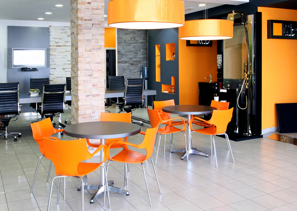
Ideas and corresponding creativity in designing and shaping office fit outs for modern business and commercial premise is an important factor for the brand image of the company and also for properly addressing the economic constraints on space and utility. Cafeteria is an integral part of any modern office set up. It is the place for the employees to hang out in their brief breaks and it is also the place where employees informally meet and communicate with each other. Cafeteria is where you get cooled down with a mild drinks or coffee after a heated row with your superior or it is where business managers share their idea to hit the next big contest or it may be the place where you get to know the soft side of your boss. But how you would feel the environment if the cafeteria seems too congested with bizarre sitting arrangement? Alternatively, you cannot think of a cafeteria with a dominantly somber mood of color that looks too professional like the front desk or it cannot be either like a school canteen room. Let us go through some ideas as how to plan office fit out for cafeteria.

Conforming the Brand Image
Just like the reception, or the meeting room or the conference hall, cafeteria should also make a distinct display of some aspects crucial to company’s brand image. The idea is even in sipping your coffee you never lose pride in the brand you are working with. It is the place where employees become more open and something that makes them remember the opportunity with the company they are working now is truly important. A distinct display board depicting the regular company events, competitions, contests, winners and tours can really be great. At least office fit outs should be planned for facilitating such display. Some other aspects like maintaining a color and design scheme that goes with the company’s theme color and logo can make an effective brand statement in the cafeteria.
Addressing the Space Constraint
The most important of all in presenting any office fit out idea is to address the space constraint. A commercial space in a busy and up-market business locality cannot afford to opt for improper utilization of space and as for cafeteria and hang out areas in commercial premises they most of the time are given the last priority after other areas of commercial activities. Naturally all that amounts to better space management like sleek design, corner to corner space utilization, smarter and less space consuming furniture and utility devices would be crucial to address this constraint and at the same time delivering a desired ambience.
Beauty and Elegance
After all even if your cafeteria is small enough to accommodate only twenty people at a time if it is designed in elegant way that make employees feel happy about the ambience, undoubtedly your office fit out designer deserves praise. In a cafeteria is where you come to relax your overstressed nerves just sipping a coffee or a cold drink or just with casual chit chat with another employee or just to have your lunch. In any case if the ambience works on you in a positive way it benefits the company in respect of output as well.
Facing a Wider or Greener or Open Space
Like the cool furniture or color schemes what really can matter is planning the cafeteria in a place overlooking a green meadow or garden or simply a window view of the wide open sky. A cafeteria space locked by other areas of office is felt typically like a backdoor joint where you get hurried to take your bite and sip and return to the desk and thus the purpose of cafeteria is not fulfilled at all. On the contrary the open space in front of your eyes while you are taking slow sips from your mug is refreshing enough to strike positive mood.
A Greener Cafeteria
To sit in a cafeteria with an exceptional collection of orchids and little indoor plants can really be refreshing. The effect can be more accentuated with the use of natural wood furnishing and furniture and invoking a sense of ecological harmony in other design attributes.

